
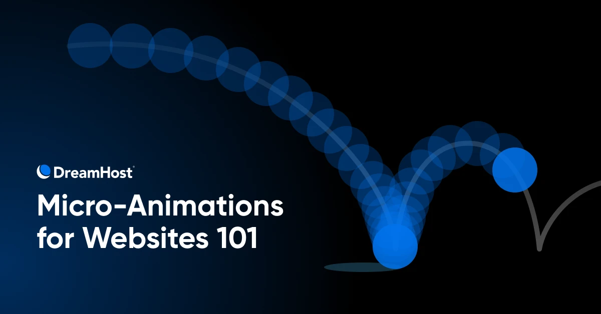
Does your website have good manners?
We’re not talking about pleases and thank yous. We’re talking about micro-animations, those subtle, functional movements that make your site feel polished, intuitive, and alive.
Because even if your copy is sharp and your pages load in a flash, a site that doesn’t respond to user actions can still feel clunky and cold. Micro-animations fill in those gaps. They guide. They reassure. They create moments of delight that stick.
Think of them as the quiet MVP of user experience (UX) — small details with a big impact.
Let’s break down how these tiny visual cues punch above their weight and how you can start using them without turning your site into a theme park.
What Are Micro-Animations?
Micro-animations are small, purposeful animations — blips of motion that help your interface speak the same language as your users. They usually last less than a second, and when used right, they make everything feel smoother, smarter, and more human.
Examples include:
- That slight bounce when you click a button
- The smooth transition when you hover over a menu item
- The satisfying little wiggle when you complete a form
- That perfect little swoop when a modal window appears
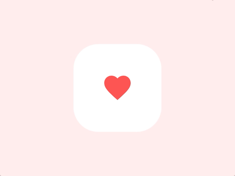
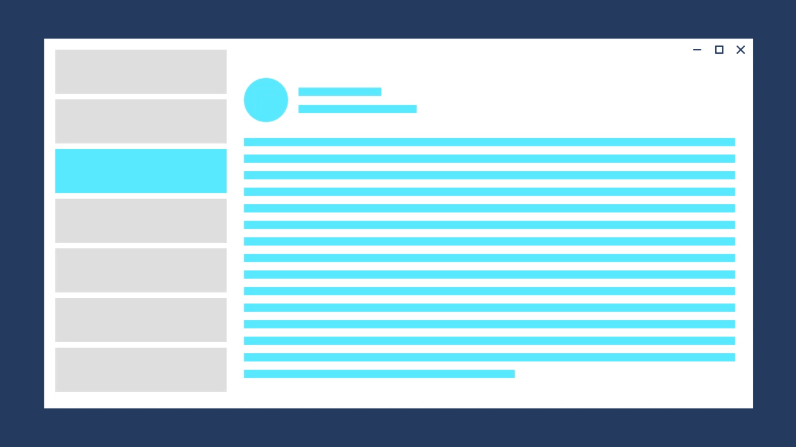
Think about how less satisfying “heart-ing” something on Instagram would be without this haptic and visual feedback:
Micro-animations are especially powerful on mobile, where space is tight and every touch counts. A tiny bounce here and a smooth fade there help users get where they want to go without second-guessing.
The Psychology of Micro-Animations (+ How They Improve User Experience)
Our brains are hardwired to notice movement. It’s an evolutionary thing. Movement could mean “food” or “danger” or “potential mate.”
Micro-animations tap into this primitive part of our brains by:
- Providing feedback – A button click that responds feels like it’s doing something (because it is).
- Making things feel faster – Even a brief loading animation buys you goodwill while content catches up.
- Reducing confusion – Animations can subtly steer attention where it’s needed.
- Building trust – Visual confirmation that something worked, like a checkmark or a progress bar, goes a long way.
- Adding delight – A small, clever animation can make your site more memorable and your brand more lovable.
Micro-animations sit in that sweet spot between lifeless icons and bandwidth-hogging video. Static visuals? They’re quick but flat. Video? Flashy but heavy. Micro-animations? They’re the Goldilocks solution — just enough movement to feel alive, not enough to tank your load time.
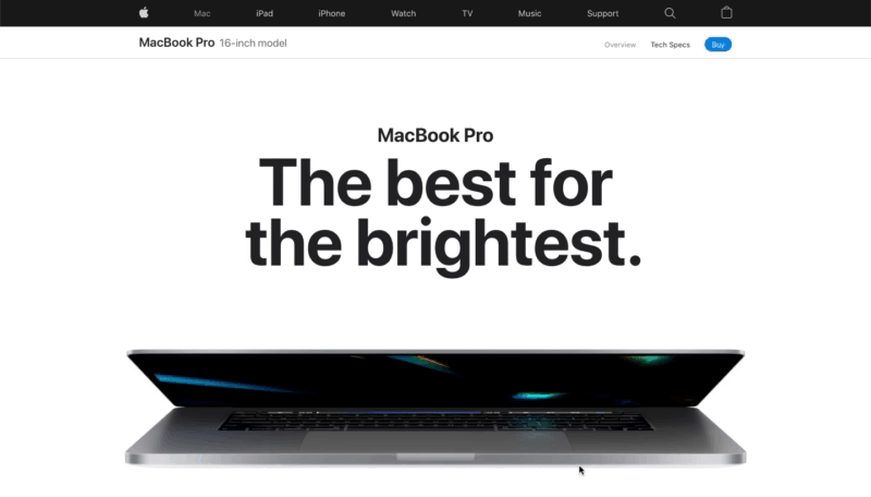
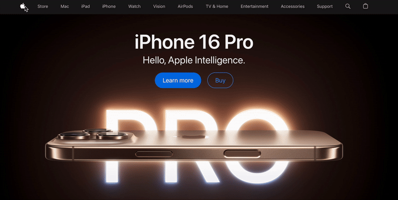
If you’ve ever been seduced by the products on Apple’s website, micro-animations have a LOT to do with that:
This is backed by cold, hard facts: studies have found that people recognize animated elements up to 60% faster than static ones, highlighting how motion can attract attention and convey information.
The business case for these tiny delightful elements is equally compelling:
- According to 34.5% of marketers, the average time spent on their website has increased significantly.
- 27.5% of marketers say animations increase click-through rates.
- In 19% of cases, marketers believe animation increases their conversion rates significantly.
Where To Use Micro-Animations (Without Being a Bother)
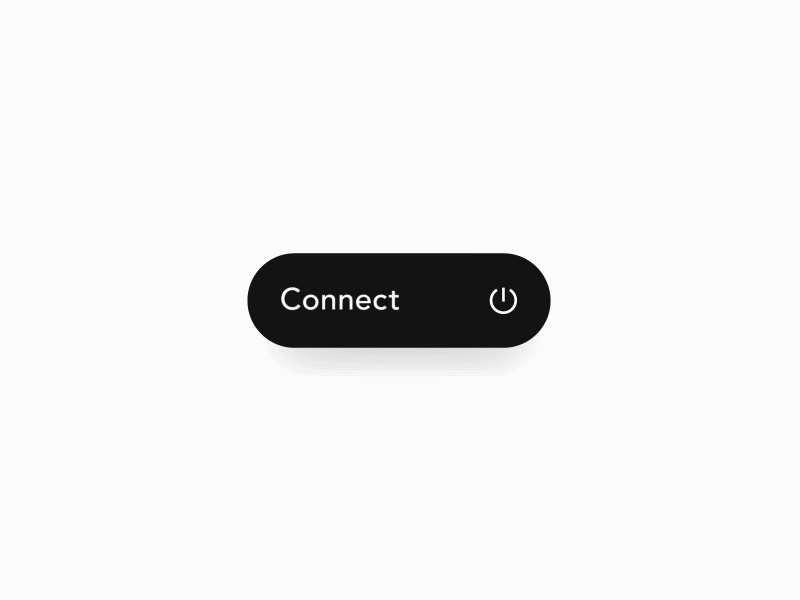
1. Button Feedback
Nothing is more frustrating than clicking a button and wondering if the website registered your desperate plea for interaction. Try adding a subtle scale or color change.
2. Page Transitions
Make moving between pages feel like silk, not sandpaper. A 0.3-second fade can make your website feel premium – Luxury, but for your eyeballs.
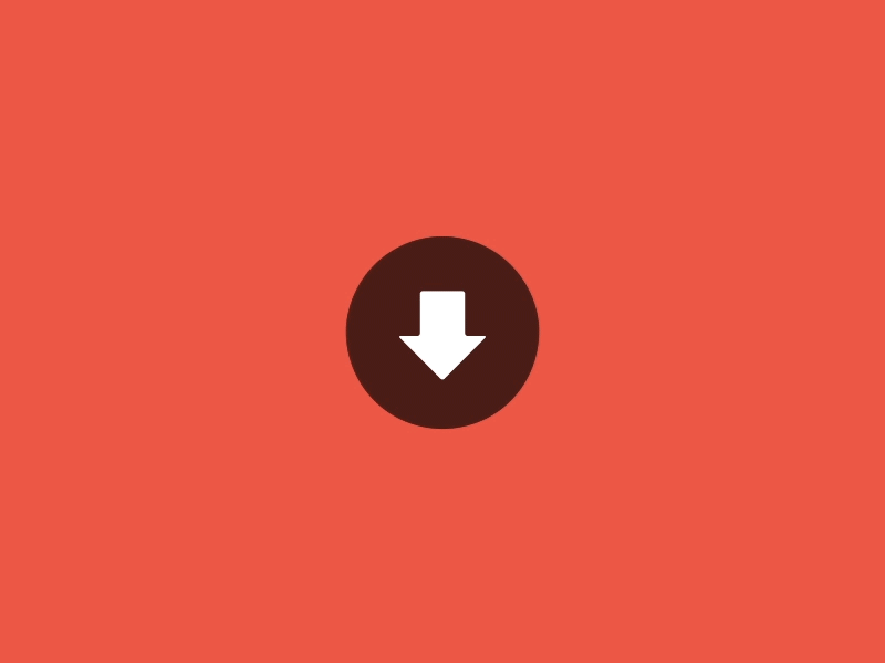
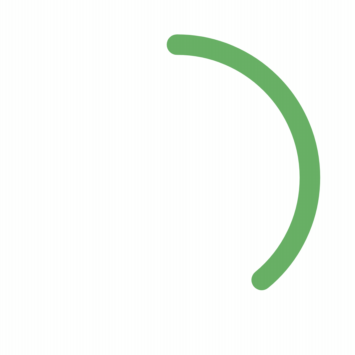
3. Loading Indicators
If your website takes more than two seconds to load something (fix that, by the way), at least entertain me while I wait. A creative loading animation can reduce perceived wait time by up to 30%.
4. Form Validation
Instead of just telling users they screwed up with angry red text, show them with a gentle shake of the input field. It’s like saying “Try again” but with jazz hands. Or tell them they’re doing great with a bright green checkmark!
3 Delightful Real-Life Examples of Micro-Animations
Let’s get specific. Here are five micro-animations that make me want to slow-clap at my screen.
1. Apple’s Navigation Menu
Hover over Apple’s mega menu and watch how elements fade in with a slight stagger effect. It’s butter-smooth and lightning-quick. This isn’t random; the animation subtly guides your eye through the product hierarchy while making the experience feel premium.
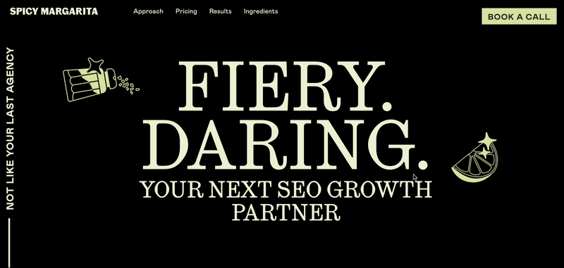
2. Spicy Margarita’s Hero Animation
The second you land, Spicy Margarita’s bold typography animates in with just enough swagger to match the brand voice. The lime slice bounces, the salt shakes, and the whole thing screams personality. It’s slick, punchy, and perfectly timed, making a loud first impression while staying clean and controlled.
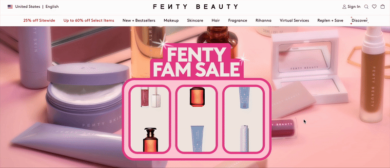
3. Fenty Beauty’s Slot Machine Animation
The Fenty homepage greets you with a playful, casino-style product reel that spins and lands with a satisfying bounce. It’s bold, punchy, and impossible to ignore — perfectly on-brand for a sale campaign. The motion adds urgency and energy without being chaotic, making the promotion feel exciting instead of intrusive.
How To Add Micro-Animations To Your Website
You don’t need a Hollywood effects budget or a developer team with Pixar résumés. Thanks to modern tools, especially low-code and no-code ones, you can add buttery-smooth motion without touching a single line of JavaScript (unless you really want to).
Step 1: Pick an Interaction
Start with something obvious: a button hover, a CTA click, or a loading spinner. You’re not reinventing the homepage but adding polish where it counts.
Step 2: Choose the Right Tool
Whether you want to drag and drop or fine-tune code by hand, there’s a tool for you.
Here’s a quick-start guide to help you find your fit.
- Experiment with CSS for simple effects: Start with hover animations to make buttons or links interactive. It’s fast, lightweight, and supported everywhere.
- Use GreenSock Animation Platform (GSAP) for advanced effects: GSAP provides versatile tools for crafting custom animations that are both efficient and high-performing, making it a popular choice for complex interactions.
- Try Lottie for scalable vector animations: Lottie enables vector-based animations that maintain quality across devices, perfect for icons and onboarding elements.
And if you want the full landscape, here’s a cheat sheet.
| Tool | Best For | Code Level | Why It’s Great |
| Webflow | Scroll animations, hover effects, element reveals | No-code | Designer-friendly and flexible, great for polished micro-interactions |
| Lottie | Lightweight vector animations | Low-code | Ideal for onboarding screens, icons, or splash animation |
| GSAP (GreenSock) | Custom, complex animation timelines | Code-heavy | Industry favorite for fine-tuned control (but needs JavaScript chops) |
| CSS Animations | Hover effects, transitions, loading states | Low-code | Perfect for clean, fast interactions |
| Motion.page | Scroll-based animations on WordPress | No-code | Drag-and-drop GSAP-powered effects for WordPress without touching a line of code |
Step 3: Test It
Your animation might look slick on your MacBook, but how does it feel on mobile? Is it fast? Does it help, or just dance around for fun?
BTW, DreamHost offers professional web hosting services to make sure your site stays lightning-fast, even with animation layers added in. And if you need a hand when bringing your animation ideas to life, our team of talented developers can help you build it without breaking your brand or your site.
Step 4: Rinse, Refine, Repeat
Once you’ve nailed one great interaction, layer in another. Maybe a scroll-triggered content reveal. Maybe a little feedback on a form submission. Build up slowly. Not everything needs motion, but the right moments? They stick.
You’re going for elevated, not overcooked.
Best Practices for Micro-Animations
The best micro-animations are invisible in the best way. You feel them more than you notice them. And that’s the goal.
But behind that smooth little fade or bounce is some serious intention.
1. Nail the Timing
Fast animations (around 150–300ms) work best for UI feedback. Think button clicks or form validations.
Google’s Material UI guidelines state that animations between 150-400ms feel smooth to the user while those longer or shorter can feel sluggish and difficult to follow.
Either way, keep it consistent. Erratic animation speeds make your site feel chaotic.
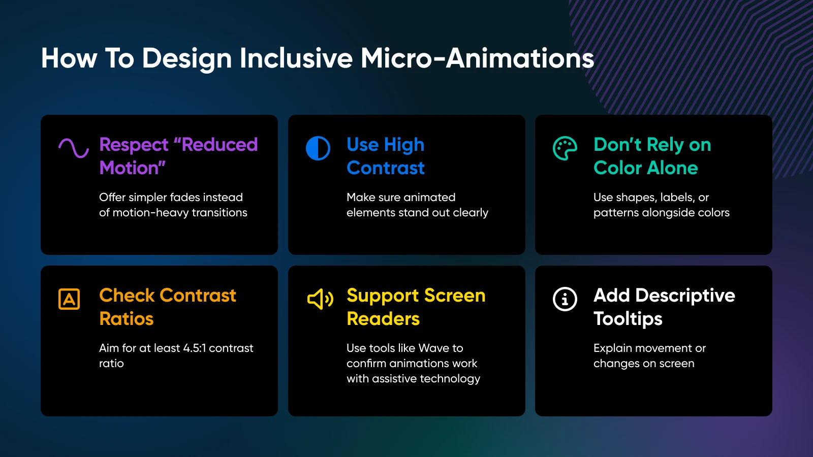
2. Make Them Accessible To Everyone
Creating an inclusive experience is table stakes. Here’s how to keep your micro-animations friendly for all users.
- Respect “reduced motion” settings: If someone has motion sensitivity, offer a simpler experience with fades instead of motion-heavy transitions.
- Use high contrast: Make sure animated elements stand out clearly, especially for users with visual impairments.
- Don’t rely on color alone: Color-blind users can miss subtle transitions. Use shapes, labels, or patterns alongside color.
- Check your contrast ratios: Aim for at least a 4.5:1 contrast ratio for animated text and icons. Test with tools like Contrast Checker.
- Support screen readers: Use tools like Wave or Axe to confirm animations don’t trip up assistive tech.
- Add descriptive tooltips or audio cues: If something moves or changes on the screen, explain it — especially if it affects the user experience.
3. Build With Intent
Every animation should answer the question: “Why is this here?” If it doesn’t make something clearer, faster, or more delightful — cut it. A great micro-animation feels inevitable, like it was always supposed to be there.
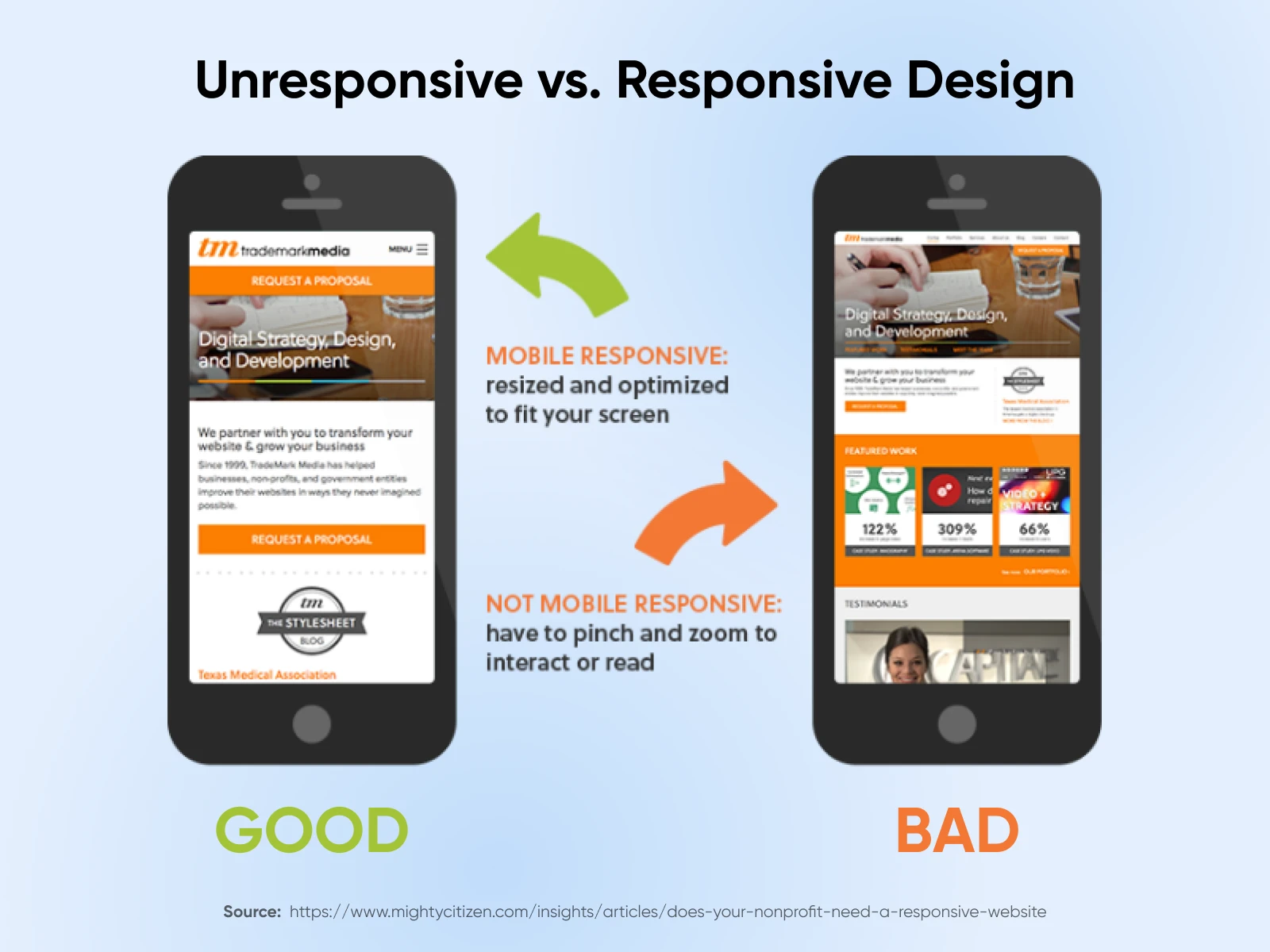
4. Test On Different Devices
A study by Akamai analyzed over 10 billion visits to top retail sites and found that even milliseconds matter. According to the research, customers go elsewhere even if a page takes longer than three seconds, with more than half leaving if it takes more than that.
Animation that feels silky on your laptop might jitter on a mid-range Android. Test on different devices, browsers, and connection speeds to make sure the experience holds up everywhere.
This is called responsive design.
5. Provide Immediate Feedback on High-Stakes Actions
Micro-animations really earn their keep on transaction-heavy pages. Think e-commerce checkouts, booking platforms, subscription signups, donation flows, or any place where customers submit payment or personal information.
A checkmark after a form submission or a satisfying bounce when an item hits the cart tells the user, “Yep, it worked.”
That tiny flash of confirmation builds trust and prevents double-clicking, rage-refreshing, or user frustration — all of which can kill your conversions.
6. Maintain Consistency
Use a design system or animation library to standardize motion across the site. A button that slides up on one page and fades on another? That’s not personality; it’s chaos.
The Little Things Are the Big Things
Micro-animations are proof that details matter. They make your product look good and feel right. A site that responds, reassures, and delights at just the right moment? That’s not fluff – That’s great product design.
Start with a button. Add a form. Sprinkle in a scroll animation. Then, keep refining. Because once you start paying attention to the little things, your users will, too — and they’ll stick around for it.
Need help figuring out where to start? Just want a gut check on your UX? DreamHost has the hosting power and dev team to make your dreams a reality.
Did you enjoy this article?