
The average eCommerce Conversion Rate hovers around 2.35%[1]. That means 97.65% of visitors leave your site without buying, which leaves business owners like you frustrated — and rightly so.
This guide will provide actionable eCommerce web design tips to optimize your online store, enhance user experience, and ultimately drive more sales.
Optimized eCommerce hosting, such as with InMotion Hosting, and best design practices ensure businesses create impressive customer experiences and maximize conversions.
Create an Effective Visual Hierarchy for Your Online Store
Visual hierarchy refers to the arrangement of design elements that guide a user’s attention through your website. It helps prioritize content, ensuring your customers can quickly find what they need.
Let’s have a look at some tips on web design visual hierarchy.
Product Grid Layouts That Convert
Opt for a product grid layout that showcases a sufficient number of products while avoiding clutter. The two effective ones include:
- 3×3 layout: In the 3×3 layout, you display three products per row and three rows per page. It’s versatile, clean, and works well for stores with a smaller product catalog.
- 4×4 layout: The 4×4 grid layout is another popular option, featuring four columns and four rows of products. This grid is ideal for stores with a large inventory and provides a more extensive view of available products.
When deciding which layout is best for you, consider your product catalog and the type of shopping experience you want to provide.
For example, if you’re aiming for a minimalist design with a focus on high-quality visuals, a 3×3 grid will serve you well. On the other hand, if you have a larger catalog and want to showcase a broader range of products in a single view, a 4×4 grid might be more effective.
Best Practices for Category Organization
To ensure a seamless shopping experience, you must organize your website’s categories effectively. Here are some best practices to do so:
- Limit the number of categories: Too many categories can overwhelm users. Aim for a balance between being comprehensive and concise. Typically, five to ten main categories work well for most stores.
- Use clear, descriptive names: Avoid jargon or creative names that might confuse shoppers. Instead, use straightforward labels like “Men’s Clothing,” “Women’s Shoes,” or “Home Decor” that instantly convey the products within that category.
- Break down broad categories: If a category contains a wide range of products, use subcategories to make browsing easier. For example, under “Electronics,” you could have subcategories like “Smartphones,” “Laptops,” and “Accessories.”
- Add icons and images: Incorporate relevant icons or thumbnail images next to category names. It enhances the visual appeal and helps users identify the category at first glance.
- Offer advanced filters: Allow customers to refine their search by price, size, color, brand, or other relevant attributes. This is especially important for stores with a large inventory.
- Highlight bestseller items: Place your most popular or profitable categories in prominent positions, such as at the top of your navigation menu or on the homepage. This draws attention to products that are more likely to convert.
Color Psychology in eCommerce Design
As per a report, color can increase brand recognition by up to 80%[2]. Therefore, you must understand color psychology to design an online store that attracts and converts casual browsers into buyers.
Here’s the role of each color in eCommerce web design:
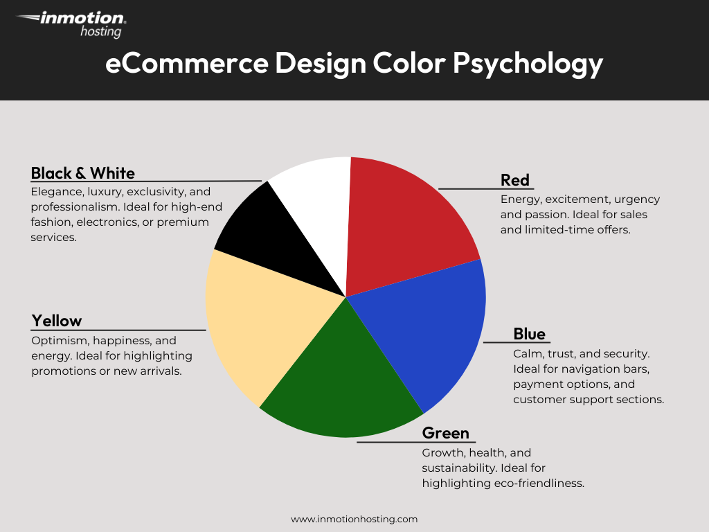
- Red: The color is often associated with energy, excitement, and passion. It’s a great choice for clearance sales and limited-time offers, as it can trigger a sense of urgency in customers.
- Blue: Blue conveys calm, trust, and security. If you’re a brand looking to build credibility, we recommend using this color in the navigation bar, payment option, and customer support section. This reassures visitors that their browsing experience is safe and secure.
- Green: The color is commonly linked to growth, health, and sustainability. Brands offering environmentally friendly products can use green in their web design to emphasize their eco-friendly values and attract eco-conscious customers.
- Yellow: This color represents all positive things — optimism, happiness, and energy. It’s a great choice for when you want to attract attention to a promotion or showcase new arrivals. Just remember, less is more. Overdoing it can make your design feel overwhelming.
- Black and white: Black communicates elegance, luxury, and exclusivity, while white delivers a sense of professionalism. They both, either individually or in combination, work well for high-end fashion, electronics, or premium services.
Call-to-action (CTA) buttons are the driving force behind sales; their visibility is crucial. You can increase their effectiveness by strategically using accent colors. For example, if your website features a blue and white color palette, a bright orange or green CTA button can create an eye-catching contrast. This, as a result, can increase click-through rates and improve overall conversion.
Mobile-First Design Strategies That Drive Sales
According to a report, mobile commerce accounts for 60% of all eCommerce sales[3]. Thus, it’s crucial to optimize your online store for small screens as well.
Optimize Product Pages for Mobile Users
To optimize product pages for mobile devices, consider the following tips:
- Prioritize key information: Mobile screens have limited space, so focus on displaying the most critical information first. This includes the product name, price, high-quality images, and a clear CTA like “Add to Cart” or “Buy Now.”
- Mobile-friendly product images: Most users rely on product images. Ensure your images are high-resolution, optimized for fast loading, and responsive to different screen sizes. To increase loading speed, you can serve images in responsive WebP format. Implement a pinch-to-zoom feature so users can also closely examine product details.
- Prominent CTA buttons: Your CTA buttons, such as “Add to Cart” and “Buy Now,” should be large, easy to tap, and prominently placed. Stick to a single, clear CTA to avoid overwhelming users and guide them toward the desired action.
- Streamlined product descriptions: Keep product descriptions concise and scannable. Break down key features and benefits in bullet points to enhance readability. Plus, you should use a professional font like Arial or Roboto and keep it large enough to read comfortably.
Mobile Navigation Best Practices
A streamlined, intuitive navigation system on your mobile store can significantly enhance user experience, reduce bounce rates, and drive conversions. Here are some best practices to optimize your mobile navigation.
- Prioritize simplicity: Keep your mobile navigation bar simple and clutter-free by displaying important pages only. This might include Home, Shop, Categories, Cart, and Account.
- Implement a sticky navigation bar: A sticky navigation bar remains visible at the top of the screen as users scroll down the page. This can significantly improve usability, as customers can access key pages (like their cart or account settings) without having to scroll back to the top.
- Hamburger menu vs bottom navigation: While the hamburger menu (three horizontal lines) is a common choice for mobile navigation, some users find bottom navigation bars more intuitive, as they place key actions (like cart, search, and home) within easy reach. Test both and choose what works best for your audience.
- Add a search function: The search bar is a critical feature that helps users find specific products quickly. Make sure it’s prominently placed and easy to access from any page.
Pro tip: Remember that a slow-loading website can frustrate users and cause them to abandon their carts. Consider hosting with InMotion Hosting, which uses NVMe servers that deliver up to 20x faster page loads for mobile users and therefore a smooth and efficient user experience.
Product Presentation That Converts Browsers to Buyers
Three in four shoppers rely on product visuals to make a purchase decision[4]. That said, you must master the art of product presentation to maximize conversions.
Here’s a quick product presentation guide.
Image Guidelines for Better Conversion
Follow these image guidelines:
- Use high-quality images: Always use high-resolution images that showcase your product’s details. Aim for a resolution of at least 1024×768 pixels to ensure clarity on both desktop and mobile devices.
- Display multiple angles: Provide images from various angles or even interactive 360-degree views. This helps customers understand the product’s form, function, and features.
- Consistent style and background: Maintain a uniform photography style across your entire catalog. Use clean, white, or neutral backgrounds to keep the focus on the product.
- Incorporate lifestyle images: Show your products in action with lifestyle images. For example, if you’re selling a coffee mug, show it being used at a breakfast table or in a cozy kitchen setting. This helps customers visualize themselves owning and using the product.
- Add scale and context: Include images that show the product’s size relative to everyday objects or models. This helps customers gauge dimensions and avoid surprises upon delivery. For instance, a picture of a model holding a handbag can give a better idea of its size.
- Use alt text: Add descriptive and relevant alt text to all images. It enhances your site’s SEO and ensures product photos are accessible to visually impaired users.
Write Product Descriptions That Sell
Writing a persuasive product description is not just about listing key features. It’s more about telling a story, addressing pain points, and creating an emotional connection with your audience.
Here’s how to write product descriptions that convert:
- Know your audience: Before you start writing, understand who your target customer is and how to tap into their needs, desires, and challenges. Tailor your language and tone to resonate with them. For example, a tech-savvy audience might appreciate detailed specifications, while a lifestyle-focused shopper may prefer descriptive, benefit-driven language.
- Focus on benefits, not just features: While features are important, customers want to know how your product will improve their lives. Instead of simply stating, “This jacket is waterproof,” explain how it will keep them dry and comfortable during unexpected rainstorms.
- Use persuasive language: Incorporate powerful words that convey emotion and urgency, such as “exclusive,” “limited-time,” “effortless,” or “transformative.” These words can create excitement and encourage action.
- Tell a story: People connect with stories. Use your product description to illustrate how the product fits into their lifestyle. For example, instead of just describing a coffee maker, you could write, “Start your mornings with the rich aroma of freshly brewed coffee, just like at your favorite café, right in your kitchen.”
- Keep it scannable: Online shoppers often skim through content. Use short paragraphs, bullet points, and subheadings to make your descriptions easy to read.
- Address objections: Anticipate and answer potential questions or concerns your customers might have. If your product is premium-priced, explain why it’s worth the investment. If it’s a tech gadget, clarify how easy it is to use. This builds trust and reduces hesitation.
- Add social proof: Incorporate customer reviews, ratings, or testimonials in your product description. Phrases like “Rated 5 stars by 500+ customers” or “Best-selling product of 2023” can drive purchases.
- Include a clear CTA: End your description with a compelling CTA that guides the customer toward the next step. Be sure to use action-oriented language like “Add to Cart,” “Shop Now,” or “Get Yours Today.”
- SEO-friendly formatting: To ensure high rankings, implement SEO-friendly formatting. Include keywords in headings (H1, H2, H3), meta descriptions, and alt text for images. In addition, break up long blocks of text with bullet points, numbered lists, and short paragraphs.
Pro tip: To effectively showcase high-quality product images, make sure your hosting plan includes sufficient storage. InMotion Hosting’s eCommerce hosting plans provide generous storage tailored for product catalogs. This way, your images load quickly.
Convert Browsers into Buyers: Strategic Design Elements
To transform casual visitors into loyal customers, your eCommerce website must employ best web design practices. These include the following.
High-Impact CTA Placement
A well-positioned CTA guides users seamlessly through their buying journey, which reduces friction and increases the likelihood of a purchase. Here’s how to strategically place CTAs:
- Above-the-fold primary CTAs: “Above the fold” refers to the area of your website that’s visible immediately upon loading, without the need to scroll. It’s an optimal place to capture attention with primary CTAs such as “Buy Now” or “Add to Cart.” Consider also adding white space around your buttons, as it can increase conversions by 232%[5].
- Secondary CTAs for comparison shoppers: Not all visitors are ready to purchase immediately. For shoppers who prefer to compare options before making a decision, add secondary CTAs such as “Save for Later,” “Add to Wishlist,” or “Compare with Similar Items.” Be sure to position them below product descriptions or alongside customer reviews to encourage engagement without overwhelming the user.
- Mobile-specific button placement: Optimizing CTA placement for mobile devices is crucial. To do so, follow these tips:
- Make buttons large and tappable: Ensure CTAs are big enough for easy tapping, ideally around 44×44 pixels or larger.
- Position in thumb-friendly zones: Place important buttons within easy reach. For example, near the bottom-center or bottom-right of the screen.
- Use sticky CTAs: Keep “Add to Cart” or “Buy Now” buttons visible as users scroll to ensure easy access at any time.
- Ensure proper spacing: Prevent accidental clicks by maintaining enough space between buttons, especially on smaller screens.
- Use high-contrast colors: Make CTAs stand out with colors that contrast against the background while ensuring readability.
Create Urgency Through Design
Urgency is an excellent way to increase conversions. When customers feel the pressure of time or availability, they are more likely to complete a purchase.
Here are some effective ways to use design to create that urgency and motivate potential buyers:
- Real-time stock level indicators: Displaying real-time stock levels can be a game-changer for encouraging immediate purchases. A simple message like “Only 3 left in stock” creates a fear of missing out (FOMO), which prompts customers to act quickly.
- Limited-time offer displays: Highlight limited-time offers, such as flash sales, countdown timers, or exclusive discounts, to encourage purchases. For instance, consider displaying a banner that reads “24-Hour Flash Sale: 50% Off!” paired with a countdown clock.
- Social proof notifications: Social proof is a psychological phenomenon where people look to others’ actions to guide their own. Incorporating real-time notifications that show other shoppers’ activities can create urgency and build trust. Examples include: “John from New York just purchased this item 2 minutes ago” or “10 people are viewing this product right now.”
Optimize Product Page Layout
A well-optimized product page can significantly enhance user experience, build trust, and drive conversions. Here’s how to create one:
- Value proposition placement: Your value proposition is the core reason why a customer should choose your product. You should prominently display it near the top of the page — ideally, just below the product name or images. Use concise, compelling language to highlight unique benefits, such as “Free Shipping,” “Lifetime Warranty,” or “Eco-Friendly Materials.”
- Price and shipping info hierarchy: Place the product price in a clear, easy-to-read font just after the description. Include shipping information below the price, such as estimated delivery times and costs. If you offer free shipping or discounts, use eye-catching badges or icons to draw attention.
- Related items suggestion: Add sections that suggest complementary accessories or upgraded versions of the product. Place them in strategic spots (like below the main product description or near the “Add to Cart” button).
Pro tip: To speed up the process, try out InMotion Hosting’s website builder, which offers 400+ eCommerce web design templates. You can install one and customize it as per your needs.
How to Optimize Visual Elements for Speed

A report reveals that 40% of users will abandon a site if it takes more than three seconds to load[6]. Optimizing visual elements for speed is therefore crucial to retain your eCommerce store visitors and convert them into customers.
To help you optimize visuals for speed, we’ve curated a list of best practices below.
Image Compression Best Practices
While high-quality visuals are important for a good shopping experience, they can slow down your website. Follow the image compression tips below to maintain a perfect balance between resolution and size:
- Use modern image formats like WebP, which offer superior compression and quality compared to JPEG or PNG.
- Compress images without noticeable quality loss via tools like TinyPNG, Squoosh, or built-in CMS plugins.
- Implement the “srcset” attribute in your HTML to serve different image sizes based on the user’s device.
Lazy Loading Implementation
Lazy loading is a design pattern that delays the loading of resources until they are needed. It ensures your media files aren’t loaded immediately when you open the web page. Instead, they load only as you scroll down, and they come into view.
You can implement lazy loading as follows:
- For Shopify: Many Shopify themes already include lazy loading functionality. However, if your theme doesn’t support it, you can use apps from the Shopify App Store, such as Lazy Load by Code Black Belt or SEO Image Optimizer.
- For WordPress: Recent versions of WordPress include native lazy loading functionality. However, if you’re using an older version or want more customization options, you can install plugins such as WP Total Cache or a3 Lazy Load.
- For custom-built sites: If you run a custom-built eCommerce store, lazy loading is a quick addition. You can use the
loading="lazy"attribute for images and iframes. Here’s a basic example for an image:<img src="https://www.inmotionhosting.com/blog/ecommerce-web-design-tips/image.jpg" alt="Product Image" loading="lazy">
Image Caching
Image caching involves storing copies of your website’s images on the user’s device (in their browser cache) or a Content Delivery Network (CDN) after the first visit. This way, when the user returns to your site or navigates to another page, the images can be loaded from the cache instead of being downloaded again from your server. This reduces load times and improves site performance.
Pro tip: To streamline your site’s performance, check out InMotion Hosting, offering built-in image optimization and lazy loading features. This ensures your store remains fast and efficient, even with high-quality product images.
User Experience Elements That Keep Customers Coming Back
To keep customers coming back and reduce cart abandonment rates, you must focus on creating an engaging yet minimalistic user experience (UX). Below are two key strategies to optimize your online store’s UX:
Streamline the Shopping Experience
According to a study, a staggering 69% of shopping carts are abandoned before completing a purchase[7]. To reduce your cart abandonment rate, consider the following strategies.
- Simplified checkout process: A complicated checkout process is one of the leading causes of cart abandonment. Streamline the process by reducing the number of steps required to complete a purchase. Offer guest checkout options, auto-fill forms, and multiple payment methods to make the process as hassle-free as possible.
- Personalized recommendations: Leverage data and AI to offer personalized product recommendations based on browsing history, past purchases, or items in the cart. This enhances the shopping experience and increases the likelihood of upselling and cross-selling.
- Easy account creation: Guest checkout is essential, but you should make it just as easy for returning customers to create an account . Offer social media login options or allow users to create an account with minimal information. This encourages repeat purchases and builds customer loyalty.
- Wishlist feature: A wishlist allows customers to save products they’re interested in for future purchases. This feature is particularly useful for customers who are not ready to buy immediately but want to keep track of items they love.
Integrate Social Proof
Integrating social proof into your eCommerce store boosts conversions and builds trust. When potential customers see that others have had positive experiences with your brand, they feel more confident about purchasing from you.
Here are some effective ways to incorporate social proof into your web design:
- Customer reviews and ratings: Display genuine customer reviews and ratings on product pages. Make sure the reviews are easy to read, filter, and sort.
- User-generated content (UGC): Create dedicated spaces on your product pages to showcase real customers using or styling your products. This could include Instagram feeds featuring tagged posts or a curated gallery of customer submissions.
- Trust badges and certifications: Security seals, money-back guarantees, and third-party endorsements (such as BBB accreditation or organic certifications) add legitimacy to your store. Place these badges in visible areas like the header, footer, or checkout page.
- Influencer endorsements: If influencers, industry experts, or celebrities endorse your products, showcase these mentions prominently. Their approval can significantly boost credibility and attract their followers to your store.
Contact Information Placement Tactics
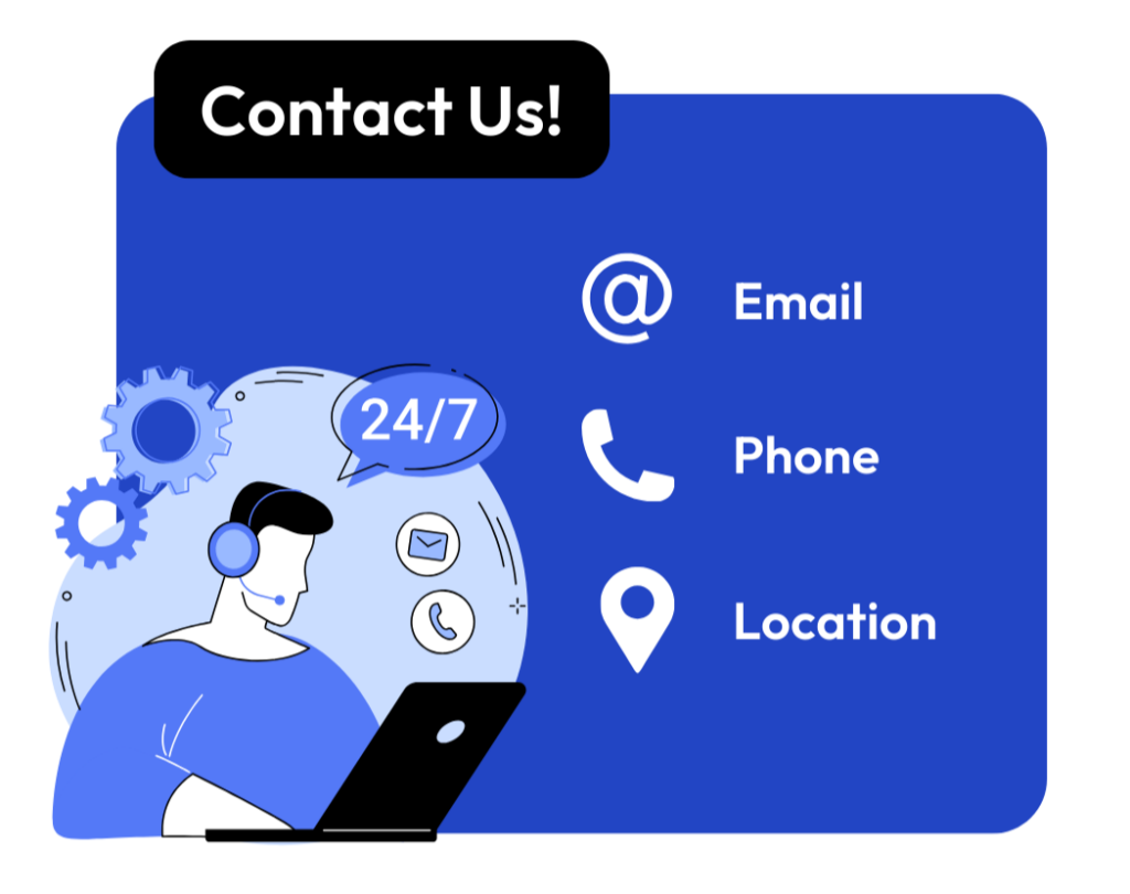
A well-placed contact section reassures visitors that assistance is readily available, which can lead to higher conversions and customer satisfaction. Optimal contact detail placements include:
- Header or top navigation bar: Include contact information in the header or top navigation bar. This is especially useful for users who want quick access to their phone number, email, or live chat option without scrolling. This might include a “Contact Us” button or a small phone icon with your number.
- Dedicated contact page: Create a well-structured contact page that includes a contact form, phone number, email address, and physical location (if applicable). Adding a map for physical retail stores is recommended. Make sure the page is accessible from the main menu.
- Sticky or floating contact buttons: Implement a floating “Chat Now” or “Call Us” button. These elements stay visible on your site as users scroll.
- Checkout and support pages: Customers may have last-minute questions before completing a purchase. Including your contact details near the checkout page and support sections can help reduce cart abandonment and increase trust.
- Live chat widget: A live chat widget is a modern and effective way to provide instant support. Place it in a visible but nonintrusive location, such as the bottom-right corner of the screen.
- FAQ or help center: If customers frequently ask similar questions, consider creating an FAQ or Help Center page. Include a prominent link to your contact information or a contact form at the bottom of the page for users who need further assistance.
- Social media links: Many customers prefer reaching out via social media platforms. Include clickable social media icons in your header, footer, or contact page to provide alternative communication channels.
Maintain Consistency Across Your Brand’s Visuals
When your brand’s design elements remain consistent, it builds trust and familiarity with your audience. This leads to better customer retention and a more professional appearance.
Visual Branding Tips
Here are a few visual branding tips for eCommerce stores:
- Create a memorable logo: Your logo is the face of your brand. It should be unique, easy to recognize, and represent your business values. Make sure it’s also scalable and adaptable for use across different platforms and devices, from website headers to social media profiles.
- Establish a clear visual style: Set the tone of your brand through a well-defined visual style. This includes choosing consistent photography styles, iconography, and illustrations that align with your brand’s voice. For example, if your brand is modern and sleek, opt for minimalist designs, while a playful brand may use vibrant, energetic visuals.
- Consistent button and UI element styles: The buttons, links, and other user interface elements should share a consistent look across your site. Use a uniform style for your CTA buttons, with the same shape, color, and size.
Typography and Color Scheme Consistency
When it comes to eCommerce web design, consistency in typography and color scheme is essential. Here’s how you can achieve that:
- Choose brand-aligned fonts: Select fonts that reflect your brand personality and align with your overall brand aesthetic. For example, if your brand is sophisticated and luxurious, opt for serif fonts that convey elegance. For a modern, minimalistic brand, clean sans-serif fonts work well.
- Limit font usage: Avoid overwhelming your visitors with too many different fonts. Stick to two or three typefaces at most — one for headings, another for body text, and an optional one for accent elements. This creates a streamlined, professional look.
- Stick to a brand palette: Choose a primary color and a secondary color palette that align with your brand’s identity. Your primary color should be bold and memorable, while you can use secondary colors to highlight specific sections or CTA buttons.
- Contrast for readability: Ensure sufficient contrast between text and background colors to make content easy to read. For example, light text on dark backgrounds or dark text on light backgrounds helps users understand your content easily.
Final Thoughts
Effective eCommerce web design is essential for creating an online store that attracts, engages, and converts customers. By following our guide, you can significantly improve your website’s shopping experience and boost your sales.
InMotion Hosting’s website builder makes it easy to implement these design tips and includes drag-and-drop eCommerce templates optimized for these best practices. This way, you can create a successful online store without any hassle.
Create a high-converting eCommerce website on our optimized hosting platform — contact us now.
Improve the performance and security of your store with specialized eCommerce Hosting. Get faster speeds for your online store with NVMe storage, server protection, dedicated resources, and optimization tools.
![]() 99.99% Uptime
99.99% Uptime ![]() Free SSL
Free SSL ![]() Dedicated IP Address
Dedicated IP Address ![]() Managed Server
Managed Server
References
- Hooda, Khyati. “51 Powerful Conversion Rate Optimization Stats to Boost Revenue [2024].” Keywords Everywhere Blog, 2 Sept. 2024, keywordseverywhere.com/blog/conversion-rate-optimization-stats/.
- “Colour Increases Brand Recognition by 80%, but How Many Brands Can You Recognise?” CEO Today, CEO Today, 21 Oct. 2024, www.ceotodaymagazine.com/2018/01/colour-increases-brand-recognition-by-80-but-how-many-brands-can-you-recognise/.
- Buchholz, Katharina. “Chart: Global Mobile e-Commerce Worth $2.2 Trillion in 2023 | Statista.” Statista.Com, July 2023, www.statista.com/chart/13139/estimated-worldwide-mobile-e-commerce-sales/.
- M., Yaqub. “9 Importance of Product Photography Statistics in Ecommerce.” BusinessDasher, 5 Nov. 2024, www.businessdasher.com/product-photography-statistics/.
- Cepeniuk, Ksawery. “Call to Action – How to Improve Conversion Rates with Ctas.” How to Boost Your Conversion Rates with Effective CTAs, 5 Sept. 2023, www.callpage.io/blog/posts/Call-to-Action-How-to-Improve-Conversion-Rates-with-CTAs.
- Larmier, Marine. “Website Load Time & Speed Statistics: Is Your Site Fast Enough?” WP Rocket, 20 June 2024, wp-rocket.me/blog/website-load-time-speed-statistics/.
- “Abandoned Cart: Common Reasons + Techniques to Reduce Lost Sales.” BigCommerce, BigCommerce, 23 Oct. 2024, www.bigcommerce.com/articles/ecommerce/abandoned-carts/.